How to Write Effective Copy for Mobile Apps
You’ve come up with a brilliant app concept. You’ve hired a fantastic app development team, such as ADAMAPP, to build it for you.
The tech is flawless, the design is beautiful - but now you need the words to match.
You need to explain to your users how to use the app and how to make the most of it. And if your app is an ecommerce app, you’ll also need sales messages written in an app-friendly style.
Copywriting for apps isn’t as simple as taking your online copywriting and reducing the font size. The skills you need to write for apps require you to think small.
Below are some insights to help you with your mobile copywriting project, along with some examples and app-copywriting tips.
Copywriting for Apps
The customer journey starts from the moment someone sees your app in the app store. The name needs to show your customer who you are - and you only have about 10-15 characters at most, so keep your name short and punchy.
If you can get them to click your app, then you have a few more words - but not many - to convince them to download it. From there, almost all apps will need a pretty basic tutorial to get them started - but you need to keep this as brief as possible, too, while still conveying the key selling points of your app.
Finally, we’re into the bones of your app. This is the fun part - where you get to take your customers on a journey with you, whether it’s a customer-loyalty app, a game or an incident-reporting tool for your staff.
Crucially, bear in mind that no matter how exhilarating the design, your app still needs words to help customers get the most from their experience - and to keep them coming back.
What is UX Copywriting?
User experience - typically shortened to UX - is about the customer journey and enjoyment of your app, website or other interface. If you want to know how to write effective copy for UX, you need to think about the customer and your goals for their experience of the app.
You might want the user to do one or more of these:
- buy the app
- watch ads
- buy items through the app
- understand more about your brand and what your company stands for
- use the app as a tool for in-house systems
The biggest mistake most people make when writing content for apps is they don’t think about the UX. They focus on the product.
Effective UX copywriting flips this on its head. Instead of trying to write content for your app that talks about all the innovative tech and your genius idea, UX copywriting focuses on the user.
Your app is always solving a problem for your customer, whether they realise it or not. That problem could be anything from, ‘I’m bored’ to ‘I need an easier way to do my accounts’.
UX copywriting for apps starts with the customer problem - not the technological wizardry - and writes with that in mind. It looks at how your app solves this customer's problem, and hones in on that throughout their app journey.
Copywriting Tips for Apps
Mastering microcopy is the key to creating a great user experience for your app. The rulebook for how to do this doesn’t exist, but we’re going to share some tips we’ve learned from our experience of developing apps for more than a decade.
1 It’s all about microcopy
Summing up complex topics in just a few words is sometimes known as ‘microcopy’. There is no definition for exactly how short microcopy is, but it’ll usually just be two or three words - or a short sentence, at most.
Think of all the titles and snippets of text you see before you get into the longer copy on social media and other sites - that’s microcopy.
Your app should be made up primarily of microcopy. It’s the basis of effective copywriting for apps.
On this page, for example, the microcopy is 7 Copywriting Tips For Mobile Apps - With Examples, as well as all of the smaller headings beneath it, such as ‘What is UX Copywriting?’ and ‘Make it personal’. When it comes to apps, the shortest possible version is usually the best one. If this page was an app, we might call it ‘Copy For Apps’ or ‘App-writer’ to make the copy even more ‘micro’.
While that all seems obvious when you think about it, don’t be fooled into thinking microcopy is simple. In fact, the opposite is true. It’s much easier to write long content than short, so we’ve put together a few tips to help you write more effective microcopy for apps.
2 Save the first impression for last
What’s in a name? When searching for apps in the app store, it’s one of only three pieces of information a user will see: Name, Category, Rating.
A good name is crucial, but don’t start with it.
There's an old writer’s trick to getting this right - leave it until the end. This is how most newspaper articles, books, films and TV shows get their brilliant title - it’s decided last. Until you fully understand all the details of your app, what you’re saying, and how you want to say it, it’s almost impossible to choose a great name.
A classic example is the website BackRub. You use it every day. But you probably know it better as Google.
That’s right. It sounds remarkable, but in its early days, Google’s founders called it ‘BackRub’. Luckily, the name was changed before it launched. Would you be as happy BackRubbing queries as Googling them? Probably not.
Like Google, start with a ‘draft name’ - preferably something less awful than BackRub - and use it throughout your app-copywriting process. Then at the end, after you’ve written everything else, come back to it. Does it still work? If so, great! But by leaving the name of your app until the end, chances are you’ll realise you need a name that fits the product better.
3 Write a snappy app-store description
Once a user has clicked on your app’s name in the app store, you have a single short sentence to convince them to download it. Do a good job, and many people will download straight away. You need to work on summing up the entire concept in a sentence - no easy task. You’ll need to think hard about the user here, and why they might want to choose your app.
In many cases, though, users will still be hesitant to download the app, so they’ll click to find out more after that first sentence, and that’s where you can expand a little.
Don’t include all the bells and whistles here. Overwhelm them with information and they’ll just leave. Keep this section description short, and use bullet points to highlight the features your potential customer will be keen on.
4 Welcome to the app
Once a user has downloaded your app, you need to work hard to keep them there - and encourage them to return.
Give them the option of a short tutorial - or the ability to skip that and start using it straight away. The tutorial shouldn’t be more than 5 screens, maximum, but less is better.
You might be tempted to write lots of words here to help your new users get the most from the app, but do that and they will almost certainly leave.
Restrict yourself to a few simple words to help them get started. 3-10 words per screen is ideal - or better yet, take them straight into the app and guide them through it with 2-3 word instructions and arrows.
5 Make it personal
Now they’re interested, a crucial way to keep users engaged is by personalising the app https://adamapp.co.uk/blog/personalisation-in-apps-an-effective-ux-strategy.
When your new users open the app, make sure their username is clearly visible so they know you recognise them. Then offer up suggestions based on their recent searches or activity. If you have a website and physical shop, connecting all of this to their user account can offer a highly personalised experience that is more likely to lead to purchases.
But as with everything else, keep the copy around this short and sweet. “You might like” is much more likely to get clicks than, “We noticed you were looking at these online, so we’ve brought you a similar selection here.”
6 Use notifications wisely
Whether alerting your users to sales or reminding them they haven’t opened the app in a while, the phrasing of your notifications needs to be handled with care.
There’s no doubt that ‘hurry’ tactics work sometimes, such as “Flash sale” or “17 hours left for 30% discount”, but overdo these and they become ineffective.
You don’t want to sound needy either, as this can be annoying and is more likely to lead to app deletions than openings.
Your notifications should revolve around rewards, statistics, questions and genuinely useful information. “Do you know how long bats live?” is much more likely to get users to click on your bird-identification app than “The birds are sad that you haven’t opened the app in 42 days.”
7 Make the final cut
Now take everything you’ve done above - plus all of the other content you’ve written for your app - and let it rest for at least 24 hours. When you go back to it, you have one goal for your app copywriting - to cut it in half.
This is tough. Editing is, in many ways, harder than writing. You’ve spent ages honing the perfect phrases - and now you need to butcher it and make it even shorter.
Writers sometimes call this “killing your darlings', because you often have to eliminate phrases you’ve grown to love. If they’re so beautiful they deserve to be kept, stick them in another word document to use in a different format that lends itself to a longer copywriting structure - such as blog posts.
Phones are tiny. Even tablets are small. When it comes to apps, shorter is always better.
App Copywriting Examples
We’ve looked at some of the best-performing apps to bring you the most effective and creative copywriting examples. These examples should help inspire and inform your own mobile copywriting.
Top-performing apps rise through the charts for many reasons, but no matter how vast the marketing budget and how excellent the idea, if users find the app copywriting confusing or poor, they will leave. It’s one tool in your app-development process, but a crucial one.
Successful app name examples
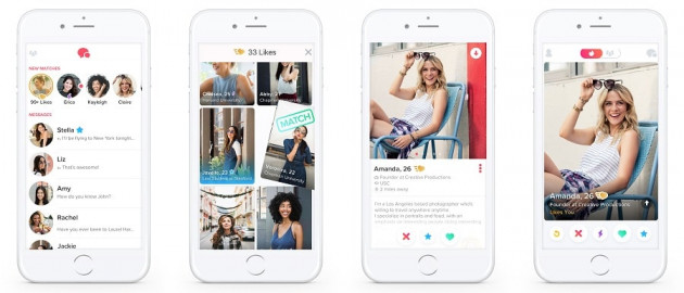
Source: Tinder.com
This dating app name references ‘matches’ and ‘fire’ - the perfect blend for a match-making app, where the goal for most users is to find someone who lights their fire.
Why has this language-learning app succeeded where other free rivals have failed? It’s appearance and functionality help, but for people looking to learn a new language, the name tells it all - you can become a dual linguist with Duolingo.
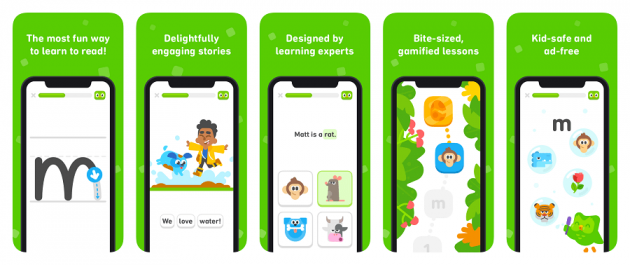
Source: Techcrunch.com
Need help de-stressing? If you look to your phone for help, you might immediately feel soothed when you see the Calm app. It immediately conveys what it does in a single word.
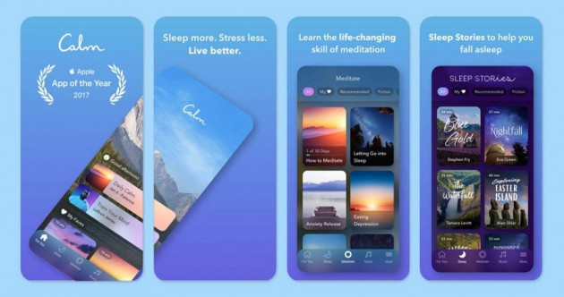
Source: onemindpsyberguide.org
If you’re looking for new walking routes and hiking paths, when you see AllTrails, you’ll instantly understand it solves your problem. In fact, it’s listed as ‘AllTrails: Hiking, Running…’ then you can’t see the rest of the description until you click. If your name is short enough to add an extra word or two after the name, this just gives you more space to sell yourself on the apps store.
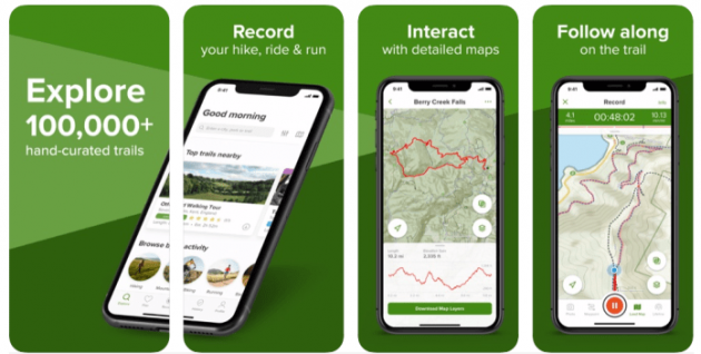
Source: terradrift.com
Short and sweet app tutorial example
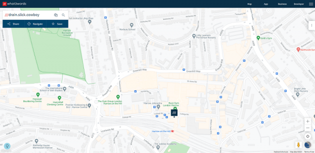
This popular map-locator app explains its concept in a short tutorial for new users. Four quick-swipe intro screens introduce the basic concept, then the snappy tutorial begins.
Tutorial 1: “Tap anywhere to discover a 3 word address”
It then gives you the three words, based on your selection.
Tutorial 2: “Tap the search box to find your 3 word address”
If you put in ADAMAPP’s address here, you’ll discover the three words for it are “drain.slick.cowboy”.
You can keep going with the tutorial, or you can skip the rest and get started at this stage by just clicking on the map. The few words in the tutorial make it pretty clear how the app works in about five seconds. A user can now get started and later be introduced to more of the app’s features.
Source: what3words.com
App microcopy copywriting example
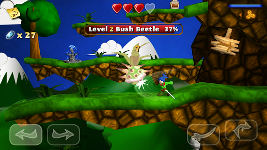
This adventure game app features short, snappy bubbles to guide users, such as ‘Tap to enter’ for all buildings and ‘Going somewhere’ when the main character runs past someone they should be speaking to.
The speech bubbles guide the user through the adventure and use simple words in short sentences. “Your master went into the woods and he should have been back by now.” Instead of a lengthy explanation, this short sentence neatly sets up the premise of the entire game, which is to find the master - and to find and put back together his broken sword.
It’s a much more succinct and engaging way of getting someone to experience your app than providing a long list of instructions at the beginning that can overwhelm them.
Source: Play.google.com
App Development Experts
If you’re thinking of developing an app, we can help you with the whole process at ADAMAPP. We have more than a decade of experience developing a wide variety of apps for customers in a range of industries. Contact us to discuss your app development needs.

